It's All About the Tones — Seeing in Black and White
This is not a blog about converting colour photographs to black and white. It is not about salvaging a disappointing image by draining the colour out of it and hoping for the best. If you spend any time in photography circles online, you will have seen that post — the one where someone explains, with a vague air of disappointment, that the conditions weren't great so they converted it to black and white instead. I want you to forget that approach entirely, because it misunderstands what black and white photography actually is.
Black and white is not a rescue operation. It is not a style filter. It is not what you do when colour doesn't work.
It is an intentional way of seeing.
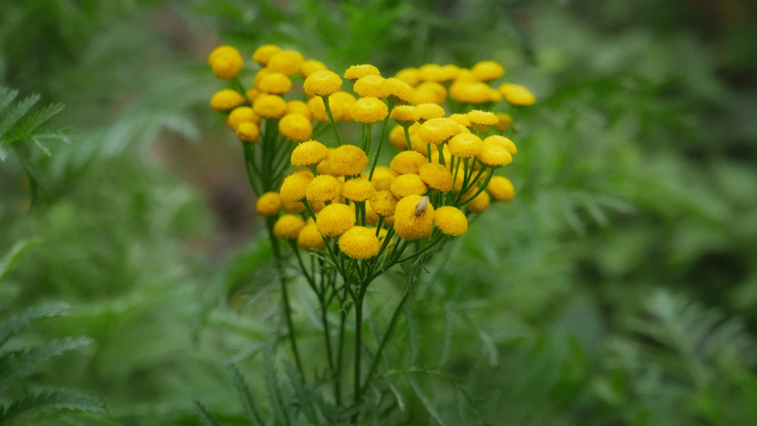
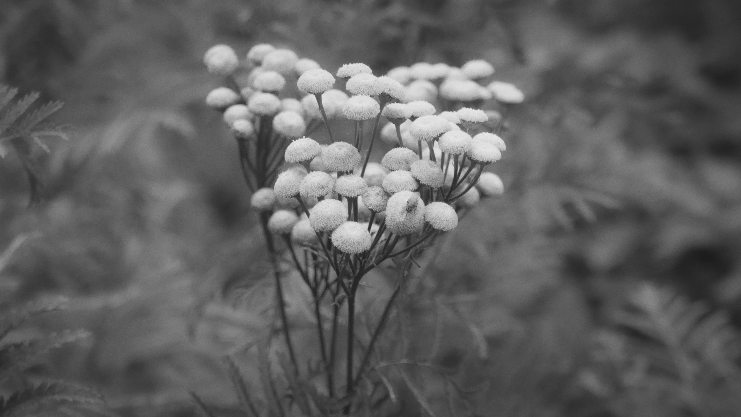
As an example below, you can see how these images react to a black and white conversion — and how a vibrant, high contrast colour image can lose almost all of its impact once the colour is removed.
This blog is about leaving the house with your camera already set to shoot in monochrome, with the full and deliberate intention of making black and white images. Not hedging. Not shooting colour and deciding later. Not keeping your options open. You have made the decision before you've taken a single frame, and that decision changes everything about how you look at what's in front of you. When you commit to black and white before you go out, you stop looking for colour and start looking for tone. That shift — which sounds simple — is actually the whole thing.
Everything that follows is built on that foundation.
RAW or JPEG — That old argument!
Before we get into tone, contrast and light, there is a conversation worth touching on, and that is about how you record your images in camera. Basically you have three choices, Raw, JPEG or Raw + JPEG.
The conventional advice — and you will find it repeated endlessly online — is to shoot RAW files and convert to black and white in post processing. The argument is that a full colour RAW file gives you more information to work with when you make the conversion. You can manipulate individual colour channels, darken the greens, brighten the reds, and use the original colour data to introduce tonal separation that might not otherwise be there. That is a legitimate approach and plenty of excellent black and white photographers use it.
For me personally I shoot JPEG only, in black and white, with the camera set to produce a monochrome file in camera. My reasoning for that choice is that I shot only black and white film for years, and I still do, though not as often. Yes years ago I did try Raw + JPEG just to be perfectly honest, but I found I was never using the RAW files. I am used to working with only black and white files, there's no colour conversion in a black and white film negative or a black and white JPEG file.
The image lives or dies on whether I read the scene correctly before I took it. That works for me, and I am comfortable with what I can achieve both in camera and in post processing with a JPEG file.
Or you just have the best of both worlds and capture in Raw + JPEG
File formats put to one side, as there will always be long standing disagreements over RAW vs JPEG — what matters in this blog is the intention behind the image. What neither format can do for you is teach you to see tonally before you press the shutter. That is a skill you develop through looking, not through software. And that skill — regardless of what file format ends up on your memory card — is what this blog is really about.
What Tone Actually Is
Tone is the entire language of black and white photography. Without colour to carry a scene, tone is all you have — and understanding what it is and how it works is the foundation of everything else.
In simple terms, tone refers to the relative lightness or darkness of any given area in an image. A black and white photograph contains a range of tones from pure white at one end to pure black at the other, with every shade of grey in between. That range is called the tonal scale, and how well a photograph uses it determines almost everything about whether it works or not.
Most of the tonal information in any given scene sits in the mid-tones — the broad range of greys between the extremes of black and white. The highlights are the lightest areas: bright sky, pale stone, sunlit surfaces. The shadows are the darkest: deep woodland, the underside of a bridge, the interior of a barn. And everything between them is mid-tone.
The skill in black and white photography is not simply capturing all of these tones — it is making them relate to each other in a way that produces a coherent and interesting image. That relationship is what we call tonal contrast, and without it, a black and white photograph is just a grey rectangle.
The Colour Wheel and How Colours Become Tones
Here is where things get genuinely interesting, and where a basic understanding of colour theory becomes directly useful for black and white photographers.
Every colour in a scene translates to a tone in a black and white image. Red becomes a shade of grey. Blue becomes a shade of grey. Green becomes a shade of grey. The problem — and it is a real practical problem — is that very different colours can translate to almost identical tones of grey.
Think about a garden in full summer. The red flowers and the green leaves are visually very different in colour. But when you remove the colour information, they may translate to almost the same mid-tone grey, and suddenly what appeared to be a vibrant, high-contrast scene becomes a flat, undifferentiated wash of similar tones. The colour was doing all the visual work, and once you remove it, there is nothing left.
This is why you cannot simply look at a colourful scene and assume it will produce a strong black and white image. You have to learn to look past the colour and read the tonal values directly.
The colour wheel gives you a framework for understanding this. Colours that are opposite each other on the wheel — red and cyan, blue and orange, green and magenta — will generally produce good tonal contrast when converted to black and white. Colours that sit close together on the wheel — yellow and green, red and orange — are likely to produce similar tones and low contrast. Knowing this before you press the shutter means you can make an informed decision about whether the scene in front of you has the tonal raw material to produce a strong black and white image.
The Colour Wheel and corresponding Greyscale Wheel.
Contrast — The Relationship Between Light and Dark
Contrast is how tones relate to each other. High contrast images have a wide spread across the tonal scale — deep blacks and bright whites with strong transitions between them. Low contrast images sit in a narrower tonal range — mostly mid-tones, soft transitions, a quieter, more muted quality.
Neither is inherently better. Both have their place. But understanding what produces each — and being able to read it in a scene before you shoot — is fundamental.
Harsh, directional light produces high contrast. Think of a summer afternoon with the sun at a low angle, raking across a ploughed field or picking out the texture of a stone wall. The lit surfaces are bright. The shadows are deep. The contrast between them is strong. That kind of light is what black and white photographers have traditionally looked for, and for good reason — it produces tonal drama and clear separation between elements in a frame.
Soft, diffused light — overcast days, open shade, the flat light of an overcast winter morning — produces lower contrast. The tonal range is compressed. Shadows are soft or absent. Everything sits closer together on the grey scale. That is not necessarily a problem — soft light can produce beautiful, subtle tonal work, particularly in woodland where the even illumination allows texture and detail to speak without the distraction of heavy shadow. But it requires a different kind of scene, and a different way of looking.
The single most important thing to understand about contrast is that it exists in the light, not in the subject. The same field, photographed in flat midday light and in low raking winter light, will produce completely different tonal images. Learning to read the light before you look for the subject is the single biggest shift you can make in your approach to black and white photography.
This is a good example of flat light killing a scene — the mist and rain closed in, the light drained out of it completely, and everything collapsed into the same mid-tone grey. The landscape is there but the tones have nothing to say to each other.
Texture — How Tone Reveals Surface
Texture and tone are inseparable in black and white photography. Without colour, the surface quality of objects — their roughness, smoothness, grain, wear — becomes one of the primary ways the eye reads a scene. And texture is revealed almost entirely by light.
Side lighting — light coming from the side at a relatively low angle — is the most effective light for revealing texture. It catches the surface irregularities, throws tiny shadows into the hollows and grooves, and makes a wall, a path, a ploughed field, or a tree trunk read as a surface rather than a flat shape. The same subject photographed in flat frontal light will appear almost textureless — the shadows that reveal the surface simply aren't there.
When you are out with a camera looking for black and white images, train yourself to look for surfaces where the light is doing something interesting. A frost-covered path in early morning light. A stone wall with the sun at a low angle picking out every crack and indentation. A muddy field where the tyre tracks catch the light. These are not dramatic subjects, but they are tonally rich ones, and in black and white that richness is everything.
Taken earlier on the same walk before the light failed — the lower angled morning light rakes across the surface of the standing stone, picking out every crack, indentation and weathered groove. The texture is doing all the work here, and it only exists because of the better light.
Layers and Depth — Tonal Separation in a Scene
One of the most powerful qualities of a well-made black and white landscape image is a sense of depth — the feeling that the eye can travel into the frame, moving through distinct planes from foreground to horizon. That sense of depth is created almost entirely through tonal separation.
When the foreground, mid-ground, and background of a scene each sit in a different part of the tonal scale, the eye reads them as separate layers and the image has depth. When they all sit at the same tonal value — which can easily happen in flat light or when colour was doing the separating work — they merge together and the image feels flat.
Mist and atmospheric haze are particularly useful for tonal separation in landscape photography, because they progressively lighten the tones of distant elements, naturally separating them from darker foreground material. A misty valley, a foggy morning, rain approaching across open ground — these conditions create tonal depth almost automatically, which is why overcast and atmospheric days are often more productive for black and white landscape work than bright sunny ones.
Light — Soft, Harsh, and the Role of Shadows
We have touched on light throughout, but it is worth being explicit about the relationship between light quality and black and white photography, because it is the single most important variable you are working with.
Hard light — from a direct, undiffused source — creates strong shadows with defined edges. It emphasises form and structure. It produces high contrast. It is dramatic and unforgiving. In the wrong conditions it can destroy detail in highlights and shadows simultaneously. But in the right conditions — particularly on textured subjects with interesting form — it produces images with real presence.
Soft light — from an overcast sky, open shade, or a diffused source — wraps around subjects and reduces shadow depth. It is gentler on tonal range, preserves detail across the scale, and is often more forgiving. For woodland photography in particular, soft light is frequently the better option — it allows the structure of trees and the texture of bark and ground to be read without the confusion of heavy dappled shadows.
Shadows deserve their own mention because they are not simply the absence of light — they are active compositional and tonal elements. A strong shadow cast across a path or a field creates a tonal counterpoint that can anchor an image. The shadow of a fence post, a gate, a tree — these can be as important as the subjects themselves. Learning to see shadows as photographic material rather than just areas of darkness is a significant step forward.
Using Coloured Filters
Before digital photography, black and white photographers used coloured glass filters over their lenses to control how colours translated to tones. The principle is straightforward — a coloured filter lightens tones of its own colour and darkens tones of complementary colours. A red filter, for example, dramatically darkens blue skies and lightens red or orange tones, producing the kind of high-contrast sky that was a signature of classic black and white landscape photography. A yellow filter has a similar but less dramatic effect. A green filter lightens foliage and darkens red tones.
Physical filters still exist and still work perfectly well on modern lenses — I still use screw on filters myself. For those who prefer not to use physical filters, a lot of modern cameras within their JPEG settings will have colour filter settings or most post processing software on your computer now allows you to mimic the same effects digitally. The underlying principle is identical — you are manipulating how specific colours translate to grey tones, darkening some and lightening others to introduce tonal separation that might not otherwise be there.
The key thing to understand about filter effects, whether physical or applied in post, is that they do not add contrast that was never there — they redistribute the tonal relationships between colours that already exist in the scene. A red filter will only darken a blue sky if there is a blue sky to darken. On an overcast day, the same filter will have almost no visible effect. Understanding what the filter is actually doing helps you use it deliberately rather than just reaching for it out of habit.
The Zone System — A Brief and Useful Note
Ansel Adams developed the Zone System in collaboration with Fred Archer around 1939-1940 as a method for visualising and controlling the full tonal range of a photographic image. In its full technical form, it was designed for large format film photography and involves a level of exposure and development control that is largely irrelevant to the way most of us work today.
But the underlying concept is genuinely useful, and worth knowing in simplified form.
Adams divided the tonal scale into eleven zones, numbered zero to ten. Zone zero is pure black — no detail. Zone ten is pure white — no detail. Zones two through eight are where all the detail lives, with zone five representing middle grey. The principle is that a well-exposed photograph places the important tonal elements of the scene in the zones where you can see them — shadow detail in the lower zones, highlight detail in the upper zones, with the midtones carrying the structural information of the image.
You do not need to memorise the zone numbers or apply the system formally. What is worth taking from it is the habit of thinking about where the tones in a scene sit on the scale before you expose, and whether the elements that matter to you will have enough separation to read clearly. That is essentially what the Zone System teaches, stripped back to its practical core.
Training Your Eye — Can You Learn to See in Black and White?
This is the question the whole blog has been building towards, and the honest answer is: yes, but it takes time and it takes practice, and it works best when you commit to it rather than dabbling.
The most useful thing you can do is set your camera to display a live monochrome preview — most modern cameras have this option — so that what you see in the viewfinder or on the screen is already in black and white. This is not a shortcut. It is a training tool. It allows you to read the tonal values of a scene directly, rather than trying to translate colour into tone in your head. Over time, that translation becomes automatic, and eventually you find yourself reading scenes tonally without needing the preview to help you.
The other thing that accelerates the development of a black and white eye is going out with the specific intention of finding and photographing tone rather than subjects. Not looking for a nice view or an interesting subject, but actively looking for tonal contrast, for texture in good light, for layered depth in a scene, for shadows that add to rather than complicate the image. That shift in what you are looking for changes what you find.
The truth is that for some people — those who have spent years shooting film, for example, or those who have always been drawn to graphic rather than colourful images — seeing in black and white develops relatively naturally over time. For others it requires more conscious effort. But it is learnable, and the effort of learning it changes not just how you take black and white photographs, but how you see everything.
Leave the house with your camera set to monochrome. Commit to the frame. Read the tones before you press the shutter.
That is where it starts, along with practice, practice and more practice.